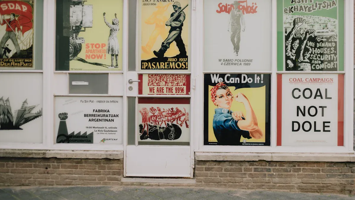
Sideways posters, called landscape posters, have a horizontal design. This style is great for showing wide pictures or text clearly. Why is landscape orientation special? It matches how our eyes move naturally. This makes it great for catching attention fast. 18×24 posters are perfect for small spaces like offices or classrooms. But 36×24 posters work best in big places like events or trade shows. They help you stand out and make a strong impression.
Key Takeaways
Sideways posters, also called landscape posters, show wide pictures and text well. They are great for catching attention fast.
Use 18×24 posters in small places like classrooms or cafes. Their wide shape makes reading easy and messages clear.
36×24 posters work best in big spaces like trade shows or outdoor events. Their large size helps people see them from far away.
Add interactive features like QR codes to get people involved. This simple idea can increase interest or attendance a lot.
Balance words and pictures carefully when making sideways posters. Use grids and empty space to keep the design neat and professional.
Benefits of Sideways Posters
Easier to Read for Text-Heavy Designs
Sideways posters are great for reading lots of text. The wide layout gives more space for your message. Instead of squeezing text into a tall space, you can spread it out. This helps people read without feeling confused or tired. For example, if you’re making an event schedule or infographic, the sideways design keeps it neat and easy to read. It’s much simpler to look across a wide poster than scroll down a long one.
Best for Wide Pictures and Panoramic Views
Wide pictures look amazing on sideways posters. They fit perfectly without cutting or squishing them. Whether it’s a pretty landscape, a map, or a chart, the horizontal style works well. Different industries use this format in smart ways:
Example Industry | How It’s Used | Result |
|---|---|---|
Farming | Better understanding for everyone involved | |
Forest Studies | Sharing research from different fields | Easier teamwork and communication |
Travel and Tourism | Comparing old and new tourist spots | Clearer ideas for planning and visitors |
These examples show how sideways posters make wide visuals clear and powerful.
Useful in Many Places and Jobs
You can use sideways posters almost anywhere. They’re great for ads, teaching, art, or personal projects. In offices, they show team goals or project plans. At events, they grab attention with big pictures and clear words. Artists and photographers love using them to display their work in shows. Sideways posters are super flexible and can work for any purpose or job.
Best Use Cases for 18×24 Sideways Posters
Event Signs for Small Areas
18×24 sideways posters are great for tight spaces. They fit well in places like cafes, classrooms, or small halls. You can put them on walls, tables, or easels easily. Their wide design makes your message clear and simple to read.
Pro Tip: Add a QR code to make your poster interactive. One charity added QR codes and saw a 70% rise in bids. This small change doubled their total bids compared to last year!
Here’s how others use 18×24 posters:
An arts group gained 40% more donors with creative posters.
A nonprofit boosted event attendance by 55% using bold designs.
These examples show how sideways posters can make a big impact in small spaces.
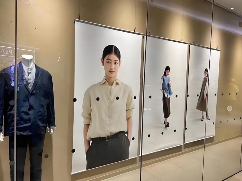
Art and Photo Displays
Artists and photographers love 18×24 posters for showing their work. This size is big enough to show details but small enough to fit most spaces. Use them for gallery shows or selling prints at markets—they work perfectly.
Printing companies like Printique and Artifact Uprising offer 18×24 options. Printique calls this size ideal for art and photos. Artifact Uprising highlights its customization choices, from 8×10 to 60×40 inches. This proves 18×24 is a favorite for creatives who want their work to stand out.
Did You Know? This size is popular for panoramic photos. The wide layout makes landscapes and city views look amazing.
Info Posters for Schools and Offices
18×24 posters are handy for sharing info in schools or offices. They’re easy to pin on boards or hang in shared spaces. Use them for team goals, safety tips, or school campaigns—they work without taking up too much room.
Schools often use 18×24 posters to improve attendance. The wide design lets you share clear messages that grab attention. For example, a poster about school attendance can have bold titles, fun visuals, and helpful tips—all easy to understand.
Quick Tip: Bright colors and simple fonts help posters stand out in busy areas like hallways or break rooms.
From event signs to art displays and school tools, 18×24 sideways posters are super useful. Their small size and wide layout make them a smart choice for many situations.
Best Use Cases for 36×24 Sideways Posters
Big Ads and Promo Banners
Need to grab attention fast? Use 36×24 sideways posters. Their big size is great for ads and banners. Show off new products or announce events with bold designs. The wide layout makes text and pictures easy to see from far away.
Hang these posters in windows, on fences, or at outdoor events. The horizontal style is perfect for slogans, logos, and eye-catching images. For example, a bakery used a 36×24 poster to share seasonal deals. They placed it by a busy road, and their customers grew by 30% in one week.
Pro Tip: Bright colors and bold designs make posters stand out. Add a catchy phrase and a strong image for extra impact.
Trade Shows and Conference Displays
Trade shows are about standing out. A 36×24 poster can be the star of your booth. Its wide shape lets you show off your brand, products, or services clearly.
Picture this: At a tech event, your booth has a sleek 36×24 poster. It highlights your newest product and grabs attention. People stop to ask questions, and you gain new leads. That’s the power of a good sideways poster.
These posters also work for event signs. Use them to guide people to places like check-in desks or meeting rooms. Their large size makes them easy to spot in crowded areas.
Quick Tip: Match your poster with table covers or banners for a polished look.
Wide Photos and Art Displays
Artists and photographers love 36×24 posters for wide images. They’re perfect for landscapes or city views. The size shows the whole picture without cutting or squishing it.
Take the Best Friends Animal Society Poster as an example. This 36×24 design was made for a vet hospital. It shows teamwork and values while looking amazing.
Title | Dimensions | Description |
|---|---|---|
Best Friends Animal Society Poster | 36″ x 24″ | A full-bleed poster created for a veterinary hospital, showcasing the collaborative design process and the project’s values. |
These posters are also great for art shows or public spaces. Their size and shape let you create cool layouts that attract viewers.
Did You Know? Museums use panoramic posters for maps or timelines. The wide format makes complex info easier to understand.
From ads to art, 36×24 sideways posters are super versatile. Their big size and wide layout make them perfect for creative and attention-grabbing projects.
Design Tips for Sideways Posters
Balancing Text and Visuals for Horizontal Layouts
When making sideways posters, balance text and visuals carefully. The wide layout gives you space, but too much can look messy. Use grids to keep things neat. For example:
Grids make your poster look tidy and professional. Also, align text to edges for a clean style. Group related items close together to show they belong. This makes your poster easy to read and nice to look at.
Tip: Put your main message in the center and make it bold. It’s what people will notice first!
Choosing Appropriate Fonts and Typography
Fonts do more than show words—they set the mood of your poster. Serif fonts, like Times New Roman, feel fancy, while sans-serif fonts, like Arial, look modern. Rounded fonts feel friendly, and all-uppercase letters feel strong and bold.
Font Style | What It Feels Like |
|---|---|
Serif Fonts | Fancy and classic, great for formal events or art shows. |
Sans-Serif Fonts | Simple and modern, perfect for ads or tech events. |
Rounded Fonts | Warm and friendly, ideal for family or community events. |
Uppercase Text | Strong and bold, great for headlines or grabbing attention. |
Pick fonts that match your poster’s purpose. For example, a fun event might use rounded fonts, while a business meeting could use sleek sans-serif fonts.
Quick Tip: Don’t use more than two fonts. Too many fonts can make your poster look messy.
Leveraging Negative Space for Visual Appeal
Negative space, or blank space, is very important in design. It gives your poster breathing room and helps people focus on key parts. Leaving some areas empty makes your poster look balanced and clear.
Negative space separates text and pictures, making them easier to read.
It makes your poster look better and more inviting.
Using blank space well highlights your main message.
Think of it this way: a crowded poster feels confusing, but one with blank space feels calm. Use this trick to draw attention to your headline or main image.
Pro Tip: Don’t worry about empty spots. Sometimes, less is more!
Custom Orders for Non-Standard Landscape Sizes
Why Custom Sizes Are Useful for Special Projects
Sometimes regular poster sizes don’t work for your needs. Maybe your design needs more room, or you want something unique. Custom sizes let you create a poster that matches your idea perfectly.
For example, if you’re making a poster for a long hallway or a small display case, custom sizes help it look neat and professional. A different size can also grab attention because it’s not what people usually see.
Custom dimensions give you control over your design. You can adjust the size to make certain parts, like a big title or a cool picture, stand out. This makes your poster more than just a message—it becomes a creative piece of art.
Pro Tip: Measure your display area before choosing a custom size. This helps your poster fit well and avoids last-minute problems.
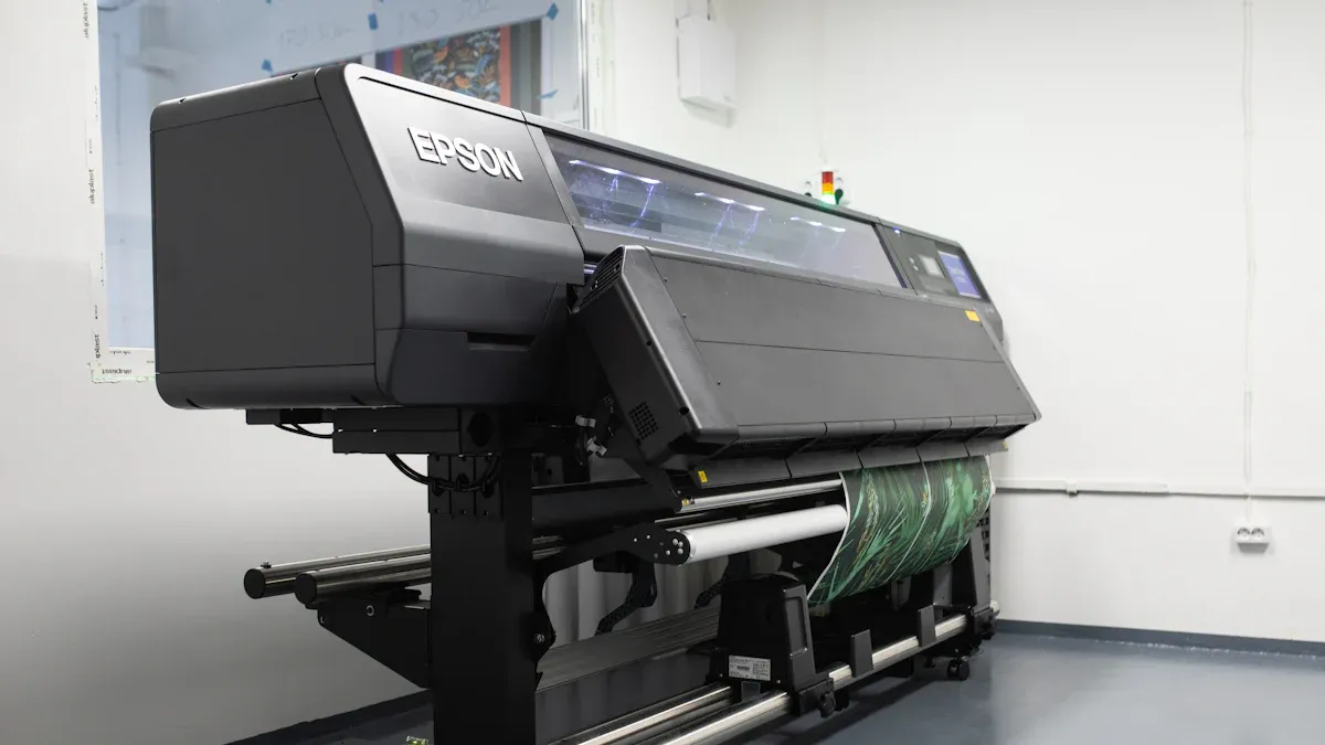
Tips for Working with Printers on Custom Posters
Working with printers for custom posters might seem hard, but it’s simple if you plan ahead. First, pick a printer with good experience. Look for one that offers extra services, like design help or easy ordering, to make things smoother.
Here’s a quick checklist for choosing the right printer:
What It Means | |
|---|---|
Proven Experience | Pick a printer with good reviews and past success. |
Extra Services | Find one that offers more than printing, like design help. |
Personalized Help | The printer should understand your needs before giving advice. |
Reliable Support | Choose a printer that helps solve problems quickly. |
Tech Partnerships | A good printer works with top tech companies for better tools. |
After choosing a printer, explain your needs clearly. Share your design, size, and any special requests early. This helps the printer understand your idea and deliver great results.
Quick Tip: Ask for a sample print if you can. It lets you check the quality and make changes before printing everything.
Custom posters take extra effort, but they’re worth it. You’ll get a poster that’s both useful and one-of-a-kind.
Sideways posters are a cool way to share your message. Their wide, horizontal design works great for big pictures, lots of text, or fun layouts. Picking the right size is important. Use 18×24 for small spaces or 36×24 for bigger areas. This helps your poster stand out and fit perfectly.
Why not make your own sideways poster? Play around with colors, fonts, and layouts to create something awesome. You’ll see how a good design can really grab attention!
FAQ
What’s the difference between 18×24 and 36×24 posters?
18×24 posters are smaller and fit tight spaces like classrooms or cafes. They’re great for compact designs. 36×24 posters are larger and work best for big events or outdoor displays. Their size makes them ideal for grabbing attention from a distance.
Can I use sideways posters for vertical designs?
Not really. Sideways posters are meant for horizontal layouts. Vertical designs look cramped on a landscape orientation. If you need a vertical format, go for portrait-style posters instead. They’ll suit your design better.
How do I make my sideways poster stand out?
Use bold colors, clear fonts, and a strong headline. Add a striking image or graphic to catch attention. Keep your layout simple and balanced. Don’t overcrowd the design—negative space can make your poster look clean and professional.
Are custom sizes worth the extra cost?
Yes, if your project needs a unique look or specific dimensions. Custom sizes help your poster fit perfectly in its display area. They also make your design stand out because it’s not the usual size people expect.
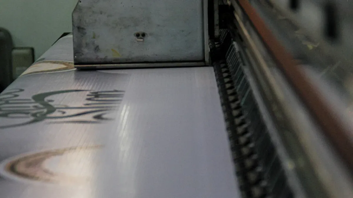
What’s the best material for sideways posters?
Choose durable materials like cardstock or vinyl for long-lasting posters. Cardstock works well indoors, while vinyl is great for outdoor use. Both options keep your design vibrant and protect it from wear and tear.