Making wide and horizontal posters can be tricky. Regular printers and paper often don’t fit these sizes. This can cause bad scaling or blurry images. You need the right tools to make them look good. Pick the right printer, good materials, and design software. Printing custom wide posters needs care and accuracy. With smart solutions, you can make posters that look amazing.
Key Takeaways
Pick wide-format printers for big posters. They can print up to 100 inches and keep pictures clear.
Use high-quality images with at least 300 DPI. This makes your poster look sharp and neat.
Plan your poster design well. Use grids and guides to keep it tidy.
Choose the right materials for where your poster will go. Use waterproof materials for outdoor posters.
Add a bleed area of 0.125 to 0.25 inches. This stops important parts from being cut off when printed.
Common Challenges of Wide and Horizontal Posters
Problems with Regular Printers and Paper Sizes
Wide posters need special tools to print correctly. Regular printers and paper are made for small sizes like letter or A4. If you use them for big posters, they might cut off parts of your design or leave blank edges. This can make your poster look messy.
Normal paper rolls or sheets are too narrow for wide designs. You might have to tape several sheets together, which leaves visible lines. These lines can ruin the look and make your poster seem less professional. To fix this, use printers and paper made for wide-format printing.
Trouble with Image Size for Horizontal Posters
Changing image size for wide posters can be hard. Stretching an image too much makes it blurry and unclear. Shrinking it might remove important parts of the design. Panoramic posters need every detail to look good.
You also need to match the image shape to the poster size. If the shapes don’t match, the image can look strange. For example, stretching a square image to fit a wide poster makes it look odd. Use clear images and adjust their shape to fit your poster.
Keeping Image Quality for Big Posters
Image quality is very important for wide posters. Low-quality images might look fine on screens but blurry when printed big. This happens because the image doesn’t have enough tiny dots to fill the space.
Start with images that have at least 300 DPI (dots per inch). This keeps your poster sharp and clear. Save your files as TIFF or PNG to keep the image quality high. Avoid formats like JPEG that lower quality. Good image quality makes your poster look amazing.
Design Constraints for Wide Poster Printing
Making wide and horizontal posters has special challenges. You must think about size, layout, and how to organize content. These factors affect how the poster looks and how it prints.
Poster Size and Orientation
Picking the right size and layout is important. Wide posters usually look better in landscape format. This makes them easier to read and follow. Portrait layouts can work for some designs but limit horizontal space. Match the layout to the message you want to share.Content Organization
Organizing content well makes your poster easy to understand. Break big ideas into smaller parts. Use pictures or charts to explain hard concepts instead of just text. Put key details at the top or center, where people look first.
Tip: Plan your design before starting. Draw a rough sketch to decide where text, pictures, and other elements will go.
Printing Logistics
Wide posters need special printers and paper. Regular printers may not fit large sizes, causing uneven edges or missing parts. Printing can take 2-4 business days, so plan ahead to get your poster on time.Visual Balance
Keep the design balanced. Don’t add too much text or too many pictures. Use empty spaces to make the poster look neat and professional. This helps people focus on the important parts.
By solving these challenges, you can make wide posters that look great and share your message clearly.
Solutions for Printing Wide and Horizontal Posters
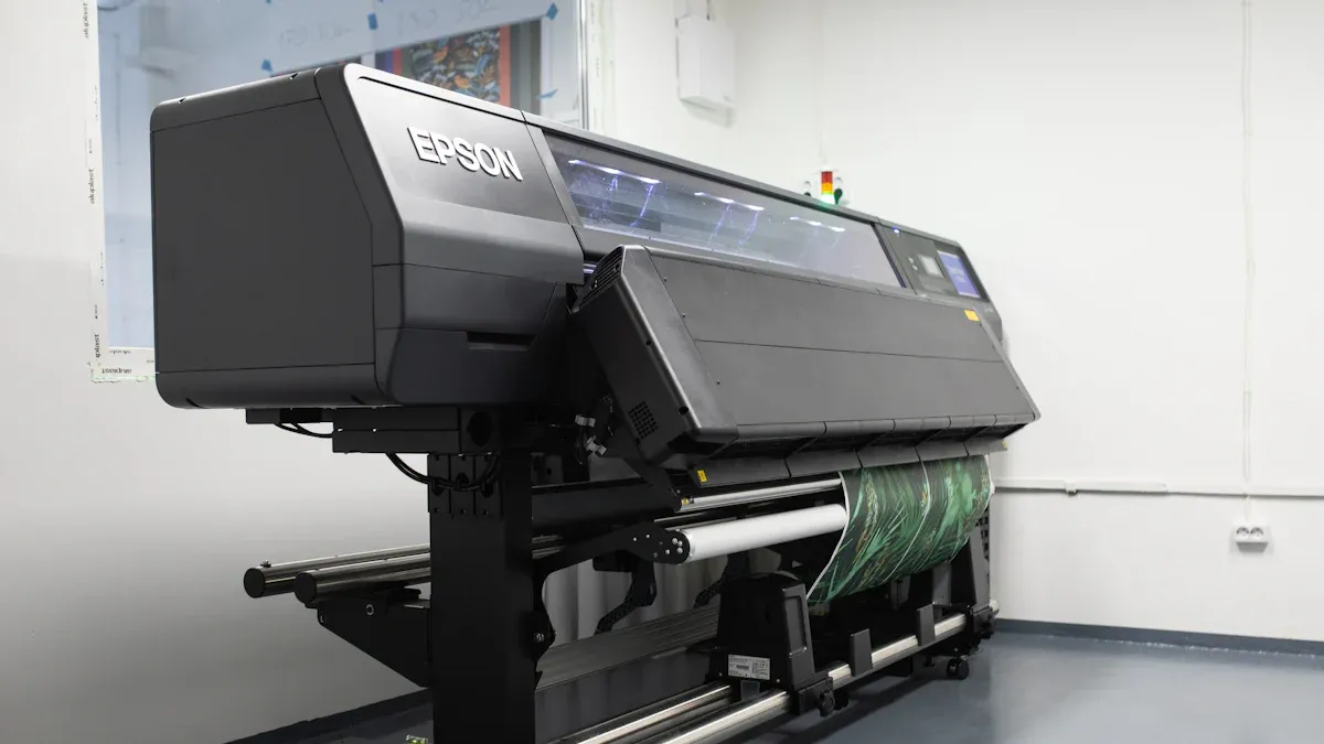
Picking the Right Printer for Wide Posters
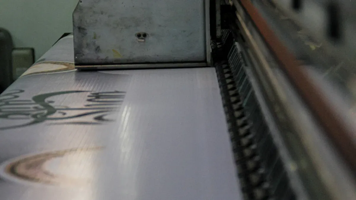
The first step to making wide posters is choosing the right printer. Regular printers can’t handle big sizes, but wide-format printers are made for this job. These printers can print on materials between 18 and 100 inches wide. They are perfect for posters, banners, and other large projects.
Here are some facts about wide-format printers:
The market for these printers was worth $9.6 billion in 2023.
By 2032, it may grow to $15.54 billion, with a 5.5% yearly growth rate starting in 2025.
Many industries like advertising and textiles use these printers because they are fast and flexible.
When picking a printer, check its resolution, speed, and material options. High-resolution printers make clear images. Faster printers save time when printing many posters. Make sure the printer can handle your poster’s size to avoid problems.
Setting Poster Sizes in Design Software
Design software helps you prepare your wide posters for printing. Tools like Adobe Photoshop, Illustrator, or Canva let you set the right size for your design.
Start by entering your poster’s exact size into the software. For example, if your poster is 24×48 inches, set these numbers in the canvas settings. This keeps your design proportional and avoids stretching. Use grid and guide tools to line up text, pictures, and graphics. These tools help make your poster look balanced and neat.
Don’t forget to add a bleed area. Add 0.125 to 0.25 inches around your design. This extra space ensures no important parts are cut off when trimming. Save your file as a high-quality format like TIFF or PNG to keep the image sharp.
Tip: Zoom in to 100% to check for blurry spots or alignment issues before printing.
Picking Materials for Wide Poster Printing
The material you choose affects how your poster looks and lasts. Different materials work better for different uses. Here’s a quick look at some popular choices:
Material | Features | Best Uses |
|---|---|---|
Wall Graphics | High-quality vinyl, good for short or long-term use | Indoor and outdoor decoration |
PhotoTex Adhesive Fabric | Easy to move, doesn’t peel or wrinkle | Works on many surfaces |
Neschen EasyDot Vinyl | Has air channels, making it easy to reposition | Retail signs and displays |
MacTac Roodle Adhesive Vinyl | Removable and easy to apply | Large posters, wall art, and murals |
Think about where your poster will be displayed. For outdoor posters, pick weatherproof materials like vinyl. For indoor posters, adhesive fabrics or repositionable vinyl are great options. These materials are simple to use and perfect for temporary events.
Note: Test the material on a small area first to make sure it works with your printer and design.
Ensuring High-Quality Resolution and Color Accuracy
Making wide posters look great needs clear images and correct colors. These two things affect how your poster looks and shares your message. Blurry pictures and wrong colors can ruin your design and confuse your audience.
Start with High-Resolution Images
Use sharp images to make your poster look professional. For big posters, use pictures with at least 100 DPI (dots per inch). This keeps your design clear, even when people see it from far away. Low-resolution pictures can look fuzzy or grainy when made bigger. Always check the image quality before starting your design.
Use Vector Files for Scalability
Vector files like SVG or EPS are best for big designs. They don’t lose quality when resized, unlike regular pictures. These files are great for logos, text, and graphics that need to stay sharp. If you’re using a logo, ask for a vector version to keep it looking good.
Manage Colors for Consistency
Getting the colors right is very important for posters. Use methods like G7 calibration to make sure colors look the same on different printers. This is extra important for brand colors that need to match perfectly.
Pick CMYK (Cyan, Magenta, Yellow, Black) for printing. This color profile works well for printed designs. Don’t use RGB (Red, Green, Blue), as it’s made for screens and might print wrong.
Tip: Print a small part of your poster first to check the colors before printing the whole thing.
Check for Vibrancy and Durability
Good images and color choices make your poster bright and long-lasting. Bright colors catch attention and make your design stand out. Durable prints stay clear and don’t fade, even for outdoor use. Using the right printer and materials helps your poster last longer.
Final Quality Check
Before printing, zoom in to 100% on your design software. Look for blurry spots, crooked lines, or color problems. Fix these mistakes before sending your design to print. Save your file as TIFF or PNG to keep all the details sharp.
By focusing on clear images and accurate colors, you can make wide posters that look amazing. These steps help your design share your message and leave a strong impression.
Design Tips for Wide and Horizontal Posters

Layout and Composition for Horizontal Poster Dimensions
Planning your poster layout takes time and effort. Divide the poster into sections to organize content clearly. Put the most important details at the top or center. This is where people look first. Don’t overcrowd any section to keep the design neat.
Pick a landscape layout for horizontal posters. This style works well for wide images and panoramic designs. Keep the layout balanced and even. If you use uneven designs, make sure they highlight key parts.
Tip: Draw your layout on paper first. This helps you plan where text, pictures, and graphics will go.
Using Grids and Guides for Custom Panoramic Poster Printing
Grids and guides are helpful tools for designing posters. They keep everything lined up and looking neat. Turn on the grid feature in your design software to create a base for your poster. Use guides to place text and pictures exactly where they belong.
Grids stop your design from looking messy or uneven. They also help split the poster into equal parts for better organization. Guides are great for lining up text boxes and keeping spaces even.
Note: Zoom in to 100% to check for mistakes before printing.
Balancing Text and Graphics in Wide Poster Printing
Good poster designs mix text and pictures well. Use short sentences or bullet points to make your message clear. Avoid long paragraphs that are hard to read.
Pick pictures that match your message. They should look good but not take over the design. Leave empty spaces between text and pictures to avoid clutter. This makes the poster easier to read.
Key Elements for Balance:
Use colors that match your brand.
Pick fonts that are simple to read.
Make sure pictures support the message, not distract from it.
A balanced design grabs attention and shares your message well. Mixing text, pictures, and empty spaces carefully makes posters stand out.
Optimizing Readability for Large-Scale Posters
Making big posters easy to read is very important. Clear designs help grab attention and share your message quickly.
Pick Big, Easy-to-Read Fonts
Use bold fonts that are simple to see from far away. Fonts like Arial or Helvetica work great for large posters. Don’t use fancy fonts that are hard to read. Adjust the font size based on how far people will stand. For example:
3 feet away: Use at least 24-point font.
6 feet away: Use 48-point font or bigger.
Tip: Print a small part of your poster to test the font size.
Keep Text Short and Simple
Write only the most important details. Use bullet points or short lists to organize information. Avoid long paragraphs that are hard to read. Focus on key details like dates, times, and locations.
Example:
Instead of writing:
“Come to our fun event at the park this Saturday, October 14th, starting at 10 AM. There will be games, food, and prizes!”
Write:
Event: Park Fun Day
Date: Saturday, October 14th
Time: 10 AM
Use Colors That Stand Out
Pick colors that make your text pop against the background. Dark text on a light background works best. Avoid colors that are too similar, like gray on light blue. For example, black text on white is easier to read than light gray on yellow.
Note: Use bright colors only for important details to avoid a messy look.
Leave Space Between Sections
Don’t crowd your design with too much text or pictures. Add space between sections to keep it neat. Use margins and padding to separate parts of your poster. This makes it easier to read and understand.
Check Readability Before Printing
Print a small version of your poster to test how it looks. Check it from different distances and angles. Ask others if they can read it easily.
By following these steps, you can make posters that are clear and eye-catching. Simple fonts, short text, and good spacing will help your message stand out.
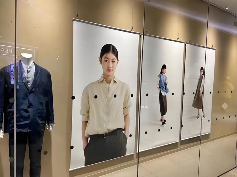
Showing Wide and Horizontal Posters
Frames and Mounting Choices for Horizontal Posters
Frames and mounts make posters look better and last longer. Pick frames that fit your poster’s size and style. Aluminum or wooden frames are strong and good for indoor use. These materials are light and easy to handle.
Foam boards and gator boards are great for mounting posters. Foam boards are cheap and light, perfect for short-term displays. Gator boards are tougher and work well for long-term use. Stick your poster to the board with spray glue or double-sided tape.
For a no-frame look, laminate your poster. Lamination adds a shiny or flat finish and protects it from scratches and water. This works for both indoor and outdoor displays.
Stands and Tools for Wide Poster Displays
Banner stands are great for showing wide posters. Retractable stands are easy to carry and set up. You can roll up your poster for storage or travel. X-banner stands are another choice. They use a light frame to hold your poster steady.
Big posters look good on tension fabric displays. These stretch the poster over a frame for a smooth look. Tabletop displays are best for small events or talks. They keep your poster at eye level so people can see it easily.
Think about where and how you’ll show your poster. Portable stands are great for trade shows or traveling exhibits. For permanent displays, wall-mounted frames or hanging systems look neat and professional.
Indoor vs. Outdoor Poster Displays
Indoor and outdoor posters need different setups to stay clear and visible. Outdoor posters face sunlight, rain, and wind. Use strong materials like vinyl and inks that resist fading.
Indoor posters don’t need as much protection. Foam boards or adhesive fabrics work well inside. Brightness matters too. Outdoor posters need 2,500–5,000 nits to be seen in sunlight. Indoor posters only need 300–500 nits.
Outdoor posters can last over 50,000 hours if made with good materials. Indoor posters don’t need to be as tough. Pick the right materials and display tools based on where your poster will go.
Case Study: Custom Panoramic Poster Printing in Action
The Challenge: Designing 24×48 Horizontal Posters
Making a 24×48 horizontal poster can be tricky. You need to balance size, image quality, and design. Regular printers and paper don’t work for these big sizes. This means you’ll need special wide-format printing tools. Stretching images to fit can make them blurry or unclear. Keeping the design sharp and clear is very important.
Another problem is organizing the content well. A wide layout needs careful planning to avoid looking messy. You must decide where to place text and pictures. This helps the poster stay neat and easy to read. Without good planning, the design can look crowded or uneven.
The Solution: Wide Poster Printing Techniques
To fix these problems, use wide-format printers made for big projects. These printers can handle materials up to 100 inches wide. Start by setting the size (24×48 inches) in your design software. Use grids and guides to keep everything lined up and balanced.
Use high-quality images with at least 300 DPI for clear results. Save your design as a TIFF or PNG file to keep it sharp. Pick strong materials like vinyl or adhesive fabric for a polished look. Add a bleed area of 0.125 to 0.25 inches to avoid cutting off important parts during trimming.
The Results: Increased Engagement with Horizontal Poster Dimensions
The finished 24×48 poster looked amazing with clear images and a clean layout. The wide format made the design stand out and grab attention. People could easily read the text and understand the message from far away. Strong materials kept the poster bright and undamaged, even in busy areas.
This method solved the challenges and made the poster more engaging. The wide size gave plenty of room for creative ideas. By using the right tools and steps, you can create posters that look just as great.
Making wide and horizontal posters can be tricky. Problems include resizing images, keeping them clear, and picking good materials. Use wide-format printers, sharp images, and strong materials to solve these issues and make great designs.
Key Takeaway: Using the right tools helps your posters look neat and stand out.
Try custom panoramic poster printing to show off your creative ideas. For more help, see our suggested guides and tools. 🎨
FAQ
What is the best printer for wide and horizontal posters?
Wide-format printers are ideal for big posters. They can print on materials up to 100 inches wide and create sharp, clear images. Choose a printer with settings that adjust for different sizes and materials.
How do you ensure images stay clear when printing large posters?
Use high-quality images with at least 300 DPI. For graphics and logos, pick vector files like SVG. Save your design as TIFF or PNG to keep it sharp when printed.
What materials should you use for outdoor posters?
Vinyl is the top choice for outdoor posters. It stands up to water, sunlight, and wind. Adding lamination gives extra protection, keeping your poster bright and strong in tough weather.
How do you avoid cutting off important parts of your design?
Include a bleed area of 0.125 to 0.25 inches around your design. This extra space makes sure no key parts are trimmed off. Always check your design carefully before printing.
Can you reuse wide posters for multiple events?
Yes, you can reuse posters if they’re printed on strong materials like vinyl or adhesive fabric. Roll them up and store them in a tube to avoid damage.
Tip: Use repositionable materials like PhotoTex. They’re easy to remove and reuse without leaving sticky marks.