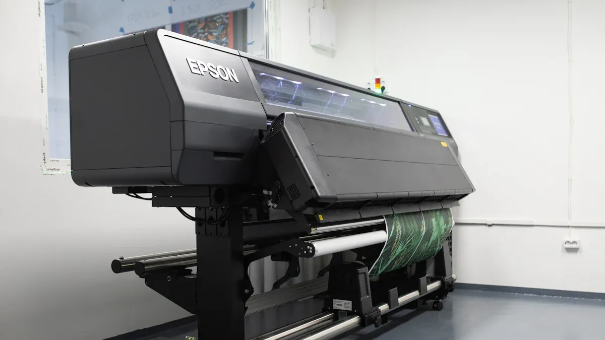
When printing large designs, getting the right colors can be hard. Tools like color gamut and ICC profiles help fix this. A color gamut is the range of colors a device can show. ICC profiles work like translators to keep colors the same on screens and printers. These tools are important because wrong colors can ruin the final look. Clients often expect perfect colors, so this matters a lot. Studies show ICC profiles match printed colors to industry rules, like GRACoL 2013. This proves they help keep colors accurate. By learning these tools, you can avoid mistakes and make bright, dependable prints every time.
Key Takeaways
Knowing color gamut is important for getting good prints. It shows the colors a printer can make compared to a screen.
Use ICC profiles to keep colors the same on screens and prints. These profiles guide how colors should look on different devices.
Soft proofing tools let you see how prints will look. They help find and fix colors that might not print right before printing.
Calibrate your monitor and printer often to keep colors correct. This stops differences between what you see and what prints.
Pick the right color space for your work. For printing, use CMYK or LAB to get bright and accurate colors in your prints.
Understanding Color Gamut in Large Format Printing

What Is Color Gamut?
Color gamut means the range of colors a device can show. Imagine it as a 3D space with hue, brightness, and saturation. Devices like screens, printers, and cameras each have their own color range. For example, sRGB was made to keep screen colors consistent. Printing needs careful setup to match RGB colors exactly. Even small changes can make printed colors look wrong.
Printers have their own color range based on inks and materials. Expanding this range needs good calibration and profiling. High-quality inks and strict controls help print colors correctly.
Gamut Limitations in Ink vs Display Devices
Printers usually show fewer colors than monitors. Monitors use RGB light, but printers use CMYK inks. This difference makes matching colors tricky.
Some monitor colors, like neon shades, are outside printer ranges. Printers guess these colors, which can make them look dull or different.
Description | |
|---|---|
Absolute Colorimetric | Clips colors, causing shifts; not great for natural images. |
Relative Colorimetric | Works well for in-range colors; adjusts out-of-range ones. |
Perceptual | Fits colors into the range; good for natural images. |
Saturation | Creates unnatural colors; not used for realistic prints. |
Knowing these limits helps you pick the best settings.
Matching Print Output to On-Screen Colors
To match printed colors to screen colors, use color management. Default settings won’t work because devices see colors differently. ICC profiles help by translating colors between devices.
Soft proofing tools show how colors will look when printed. These tools warn you about colors that won’t print right. Changing RGB to CMYK makes colors fit the printer’s range.
Different materials also change how colors print. Studies show paper texture and finish affect printed colors. Glossy paper makes bright colors, while matte paper gives softer tones. Testing materials first helps you get the results you want.
The Role of ICC Profiles in Color Management
What Are ICC Profiles?
ICC profiles are files that help devices handle colors correctly. They work like a guide to make sure screen colors match printed ones. These profiles explain how each device, like a monitor or printer, processes colors.
An ICC profile tells a device how to show colors. This helps keep your prints looking the way you want.
There are three main types of ICC profiles:
Input profiles: Help cameras and scanners capture colors properly.
Output profiles: Help monitors and printers show or print colors.
Working space profiles: Keep colors consistent in editing programs.
ICC profiles started in 1994 and changed printing forever. They created a standard for matching colors across devices, making printing more reliable.
How ICC Profiles Work Across Devices
ICC profiles connect devices with different color ranges. They adjust colors so the final print looks right. For example, monitors use bright RGB colors, but printers use CMYK inks with fewer colors. ICC profiles help balance these differences.
ICC profiles keep colors the same on screens and prints.
They are important for accurate colors in photos and designs.
Custom profiles can improve prints for specific printers and materials.
A Stanford study showed why ICC profiles matter. It found that even the same monitor models can show colors differently. This caused confusion for 23% of buyers. This proves why good color management is needed.
In Sweden, newspapers used one ICC profile for all printers. This made their colors consistent and improved their workflow for big printing jobs.
Installing and Using ICC Profiles Effectively
Installing ICC profiles is easy. Most devices come with basic profiles, but you can download custom ones for better results. To use an ICC profile:
Add it to your software, like Photoshop or Illustrator.
Pick the right profile for your paper before printing.
Print a test to check if the colors look right.
Each type of paper needs its own ICC profile. Always choose the correct one before printing.
Custom ICC profiles give you more control over colors. They let you adjust settings for specific printers, inks, or papers. Updated guides from the ICC explain how to use these profiles for the best results.
Using ICC profiles well can stop problems like wrong colors or dull prints. This makes sure your designs look just as good on paper as they do on your screen.
Best Practices for Managing Color Gamut
Soft Proofing and Gamut Warning Tools
Soft proofing shows how colors will look when printed. It mimics the printer’s colors on your screen. This helps you spot problems before printing. Gamut warning tools mark colors the printer can’t show. You can then fix these colors for better results.
LAB color management helps keep colors accurate during soft proofing. It has more colors than RGB or CMYK. This keeps colors steady across devices and stops shifts when printing.
To use soft proofing, turn it on in your design software. Pick the ICC profile for your printer and paper. This makes the preview match the final print. Fixing out-of-gamut colors early saves time and materials. It also improves your print quality.
Choosing the Right Color Space for Your Project
Picking the right color space is key for good color control. Digital projects often use sRGB. Printing projects work better with CMYK or LAB. LAB has more colors, making it great for bright, detailed prints.
XCMYK printing adds more colors to standard CMYK for better results.
G7 methods help keep colors steady on different materials.
Think about your project and materials when choosing a color space. Glossy paper needs a wider range for bright colors. Matte paper works better with softer tones.
Editing and Converting Profiles in Adobe Suite
Adobe Suite has tools to edit and change ICC profiles. These tools help keep colors the same on all devices and materials.
Go to Tools > Print Production and open Convert Colors to manage changes.
Use Edit > Convert To Profile to switch your document’s color space.
Turn on Preview to see how the changes look.
ICC profiles are vital for keeping colors correct when editing. Without them, colors might look wrong and need fixing.
Adobe Suite also supports advanced profiles like Multichannel for extra color channels. Device Link profiles directly connect device color spaces. These tools give you more control over colors, ensuring prints look as planned.
Getting Accurate Colors in Printing
Adjusting Monitors and Printers
Adjusting your monitor and printer helps match screen and print colors. Use tools like X-Rite EyeOne or Spyder 3 Elite for this. These tools fix brightness, contrast, and colors to meet standards.
ICC profiles are important for keeping colors the same on devices. They connect your monitor and printer for consistent results. Without calibration, prints might look faded or wrong compared to your design.
Tip: Adjust your monitor in a room with neutral light. This stops other lights from changing how colors look.
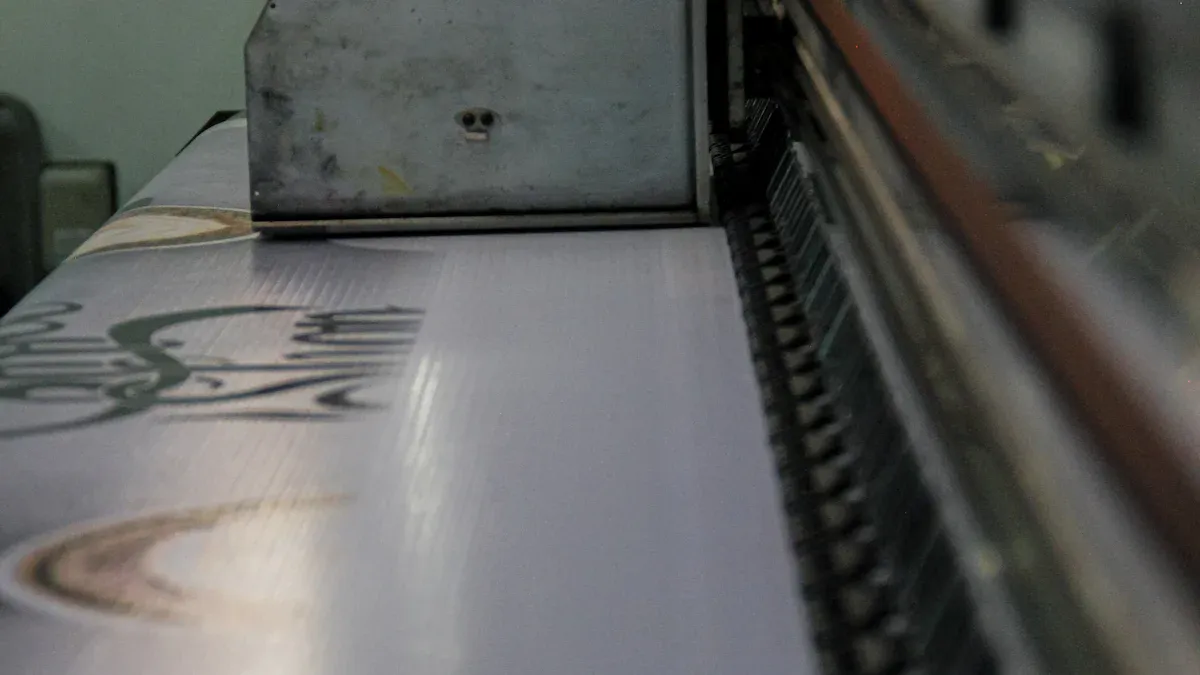
Picking Good Inks and Paper
Good inks and paper make printed colors look better. Thick inks give stronger colors by staying on the surface. Studies show these inks make colors 67% brighter on shiny paper. They are great for colorful, detailed prints.
The paper you use also matters. Shiny paper makes colors pop, while matte paper gives softer looks. Coated paper is best for sharp prints because it stops ink from spreading.
Note: Test your inks and paper before big print jobs. This avoids surprises.
Updating and Testing ICC Profiles Often
Keep ICC profiles updated to match new software, printers, and papers. Old profiles can cause color problems and waste materials. Testing profiles makes sure they work well with your printer and paper.
To update, check your printer or software company for new profiles. Add them to your design program and do a test print. This finds problems early and keeps colors accurate.
Tip: Make custom ICC profiles for your printer and paper. This gives the best colors for your projects.
Troubleshooting Common Color Problems
Finding and Fixing Color Changes
Color changes can make prints look wrong or unexpected. These problems often happen because of bad monitor settings, wrong ICC profiles, or poor lighting. Fixing these issues helps your prints look like your design.
Problems like bad monitor settings or wrong ICC profiles can hurt color accuracy. Fixing these makes colors better.
Steps to fix color changes:
Check room lighting and screen angles during setup.
Use the right ICC profiles for your printer and paper.
Just using smart tools isn’t enough. You need to organize your process and make changes to avoid mistakes in printing.
Fixing Colors Printers Can’t Show
Some colors in your design might not print correctly. These are called out-of-gamut colors. They can look dull or wrong in prints. To fix this, learn what your printer can and can’t do. Then adjust your design to fit.
Steps to fix out-of-gamut colors:
Use software to keep color settings the same on all devices.
Pick the right color space, like CMYK or LAB, for your project.
Avoid using extreme colors that printers can’t handle.
Print tests to find and fix problem colors before finishing.
The materials you use also matter. Paper type and ink can change how colors look, so test them first.
Keeping Colors the Same on All Devices
Making sure colors match on all devices is important for good prints. Without proper setup, colors can look different on your screen, printer, and final product. This can mess up designs and branding.
Use tools to adjust colors on all devices.
Apply ICC profiles to keep colors consistent.
Update profiles often to match new tools and software.
Adjusting colors on all devices is key for accurate prints. It helps improve quality and keeps designs looking right.
People in jobs like graphic design need steady colors for their work. By setting up devices and using ICC profiles, you can get great results that meet professional standards.
Knowing how to handle color gamut and ICC profiles is important. These tools help keep colors steady and correct on screens and prints. Good color control stops errors and makes your prints look professional.
To get great results, follow these tips: adjust your monitor and printer often, pick ICC profiles that match your paper, and test inks and paper before big print jobs. Doing this helps you make bright, dependable prints every time.
FAQ
What is the difference between RGB and CMYK color modes?
RGB uses red, green, and blue light for screens. CMYK uses cyan, magenta, yellow, and black inks for printing. RGB shows more colors, but printers change it to CMYK. CMYK has fewer colors. Design in CMYK to get accurate prints.
How do ICC profiles improve print quality?
ICC profiles keep colors the same on all devices. They adjust colors from your screen to your printer. This stops color mismatches. Using the right ICC profile for your printer and paper makes prints match your design.
Why do printed colors look different from screen colors?
Screens use light to show colors, but printers use ink. This difference changes how colors look. Screens often show brighter colors than printers can make. ICC profiles and soft proofing tools help you fix these differences.
Can I use the same ICC profile for all projects?
No, each project needs its own ICC profile. Profiles depend on your printer, ink, and paper. Using the wrong profile can mess up colors. Always pick the profile that matches your tools and materials.
How often should I calibrate my monitor and printer?
Calibrate your monitor and printer every month or before big projects. Regular calibration keeps colors accurate. Use tools like colorimeters to fix brightness, contrast, and colors for better results.