Getting colors right is key to keeping a brand consistent. If your brand colors look different on banners, posters, or displays, it can confuse people and hurt your brand image. Matching colors perfectly is hard because of limits in print colors, differences between screen and print, and changes in device settings.
Keeping brand colors the same needs careful color control to calibrate color accuracy. For example:
Tools like spectrophotometers with 8mm openings help read colors better.
ICC profiles make sure machines stay within set color limits.
Software checks if colors match and gives pass/fail results.
Fixing color accuracy makes sure your brand colors look the same everywhere. This builds trust and helps people recognize your brand.
Key Takeaways
Adjusting colors is important to keep brand colors the same. This helps customers trust and recognize your brand easily.
Tools like spectrophotometers and ICC profiles make colors match well. They work no matter what printer or material you use.
Check your printer and screen often to avoid color problems. This makes sure the screen colors look the same when printed.
Use RIP software to handle color settings better. This software keeps colors accurate and makes printing easier.
Always ask for a color sample before big print jobs. This step finds color mistakes early, so the final print looks right.
Why Calibrate Color Accuracy in Large Format Printing?
The Impact of Brand Color Inconsistencies
If your brand colors don’t match on printed items, it can confuse people. For example, imagine your company’s blue looks bright on one banner but faded on another. This makes your brand seem messy and less trustworthy. Keeping colors the same helps people trust and remember your brand.
Color mismatches often happen because of changes in printing settings, materials, or thickness. For instance:
Small changes in material thickness can cause big color differences.
Over 90% of color changes come from just two main factors, showing how important it is to control printing details.
To fix this, you need to adjust color accuracy. This makes sure your prints always match your brand’s colors, no matter the printer or material. Doing this protects your brand’s image and keeps everything looking professional.
Applications Where Precision Is Crucial (Retail, Trade Shows, Art Reproduction)
Some industries need perfect color matching because small mistakes can cause big problems. In retail, your store signs and ads must match your brand colors. If they don’t, customers might get confused, and your marketing won’t work as well. At trade shows, your booth needs accurate colors to grab attention. If your banners don’t match, you could lose customers.
Art reproduction also needs exact color matching. Artists and galleries depend on accurate colors to copy original artwork correctly. Bad tools or poor lighting can mess up colors and ruin the quality. Using automated tools and proper calibration fixes these problems, keeping colors consistent across different printers.
Common problems include bad test prints, unstable printers, and uncontrolled settings. Solving these issues means managing colors carefully. By calibrating color accuracy, you can keep your prints looking great and meet high industry standards.
Understanding Color Profiles and Gamut in Printing
sRGB vs AdobeRGB vs CMYK: What’s Best for Large Format?
Picking the right color profile is important for clear, bright prints. Each profile has a purpose, and knowing their differences helps you choose wisely:
sRGB: This is the most common profile and works for screens. It has fewer colors, so it’s not great for top-quality prints. But it’s easy to use and fine for simple projects.
Adobe RGB: This profile shows more colors than sRGB. It’s great for professional printing because it makes colors look brighter and more accurate. However, it’s harder to manage.
CMYK: This profile is different because it’s made for printing. It starts with white and mixes inks to create colors. That’s why it’s the best choice for large format printing.
For big printing jobs, CMYK is usually the best fit. But using Adobe RGB while designing can improve color accuracy. Then, convert to CMYK before printing. This way, your prints will look closer to your original design.
How Color Gamuts Affect Output Quality
A color gamut is the range of colors a device can show. Bigger gamuts mean brighter, more accurate prints, but they need careful handling. Differences in gamuts can change how prints look.
Delta E (ΔE) measures how much colors differ. Lower ΔE numbers mean better accuracy. Good prints usually have ΔE values of 3.00 or less, meeting standards like GRACoL 2013.
Statistical Process Control (SPC) helps keep colors steady over time. This ensures prints stay consistent and high-quality across many jobs.
Control charts are used to check if printing stays stable. This step helps avoid sudden color changes.
By adjusting your printer and using tools like ICC profiles, you can handle color gamuts well. This keeps your prints professional and your brand colors consistent. Fixing color accuracy lowers the chance of mismatched colors and improves print quality overall.
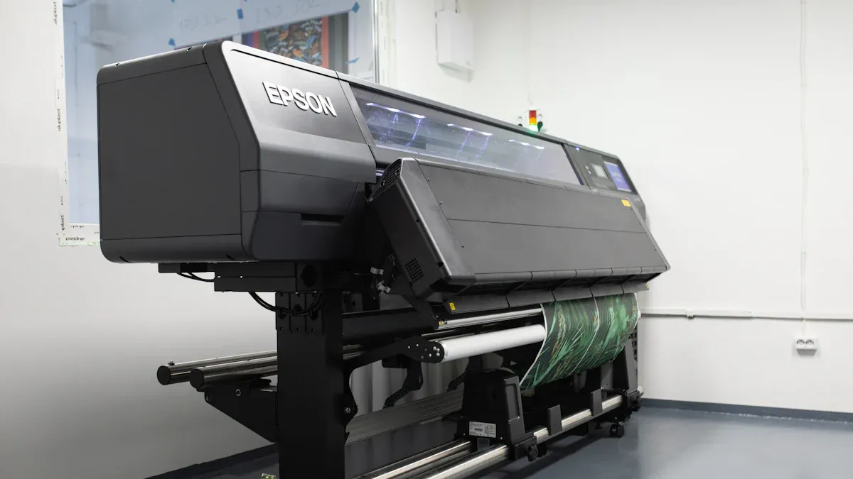
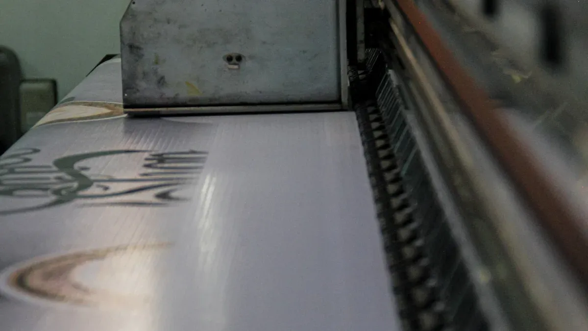
Tools and Techniques for Large Format Color Matching
Spectrophotometers & Calibration Hardware
Spectrophotometers are tools that help match colors in printing. They measure printed colors and create profiles to keep prints accurate. Using them ensures your brand’s colors look the same every time. Follow these steps to use a spectrophotometer:
Pick a color profile that fits your printer, ink, and paper.
Use a spectrophotometer to measure colors correctly.
Set your printer to high-quality mode for better prints.
Print a test chart from the calibration tool’s software.
Measure the test chart colors with the spectrophotometer.
Adjust printer settings based on the measurements. The software will suggest fixes or make a new profile.
Save and use the new profile in your printer or design software.
These steps help keep colors consistent across different print jobs. Spectrophotometers also fix errors caused by materials or environment changes, ensuring professional results.
Tip: Calibrate your printer often to stop color changes over time. This keeps prints matching your brand standards.
RIP Software with Built-in Color Control Features
RIP software helps printers understand digital designs while keeping colors accurate. It has features that make managing colors easier. Here’s what RIP software can do:
Color Matching: It adjusts colors in your design to match the printed output.
ICC Profile Integration: Load ICC profiles to match your printer, ink, and paper. This keeps prints within the right color gamut.
Spot Color Management: Define and control special colors like Pantone shades for exact matches.
Proofing Tools: Preview your design before printing to catch mistakes early.
RIP software makes printing simpler and reduces manual fixes. It keeps prints consistent, even when using different printers or materials.
Note: Pick RIP software that works with your printer and updates often. This ensures it stays compatible and has the latest features.
Best Practices to Keep Brand Colors Consistent in Printing
Using ICC Profiles the Right Way
ICC profiles help your prints match your brand’s colors. They connect your design software, screen, and printer for consistent results. To use them well, pick the right ICC profile for your printer, ink, and paper. Many printers have built-in profiles, but custom ones often work better.
Always include ICC profiles in your design files. This keeps colors the same when moving files between devices. Update profiles often to handle changes in printer performance or materials. Studies show that managing ICC profiles helps protect brand identity and saves money. Using ICC profiles properly gives you high-quality prints with fewer mistakes.
Calibrating Monitors & Checking Proofs Before Printing
Your monitor affects how you see colors while designing. If it’s not calibrated, screen colors may not match printed ones. Use tools like colorimeters to calibrate your monitor regularly. Set it to a neutral temperature (around 6500K) and adjust brightness for your workspace.
Proofing is also important. Soft proofing lets you see how your design will look when printed by using ICC profiles. Hard proofing means printing a small sample to check colors. Both methods help find problems early, saving time and materials. Reports show that good proofing and calibration improve efficiency and reduce waste, helping your business and the planet.
Teaming Up With Color-Calibrated Print Experts
Working with print experts who focus on color calibration keeps your brand colors consistent. Choose partners who use tools like spectrophotometers and RIP software for accurate color matching, even on tricky projects.
Clear communication with your print partner is key. Share your brand’s color details, like Pantone codes or ICC profiles. Check test prints often to ensure accuracy. Studies highlight that teamwork between businesses and printers leads to better brand representation, especially in global markets where unity matters. By partnering with skilled print experts, you can protect your brand’s image and gain customer trust.
Tip: Always ask for a color proof from your print partner before approving big print jobs. This ensures the final product meets your expectations.
Final Checklist for Long-Term Color Accuracy
Maintenance Schedule for Printers & Software
Taking care of your printer and software keeps results steady. A well-kept printer gives sharper prints, better colors, and fewer mistakes. Follow a regular schedule to enjoy these benefits:
Key Point | Description |
|---|---|
Regular cleaning stops clogs and spreads ink evenly. This keeps print quality and colors steady over time. | |
Enhanced Print Quality | A clean printer makes sharper, brighter prints for better results. |
Color Consistency | Routine care keeps colors accurate by avoiding ink buildup or residue that changes colors. |
To care for your printer, clean the print heads often and check for damage. Update the printer’s software to get new features and fixes. Schedule calibration to match your brand’s colors. These steps improve print quality and help your printer last longer.
Tip: Keep a log to track cleaning, updates, and calibration. This helps you stay on top of maintenance tasks.
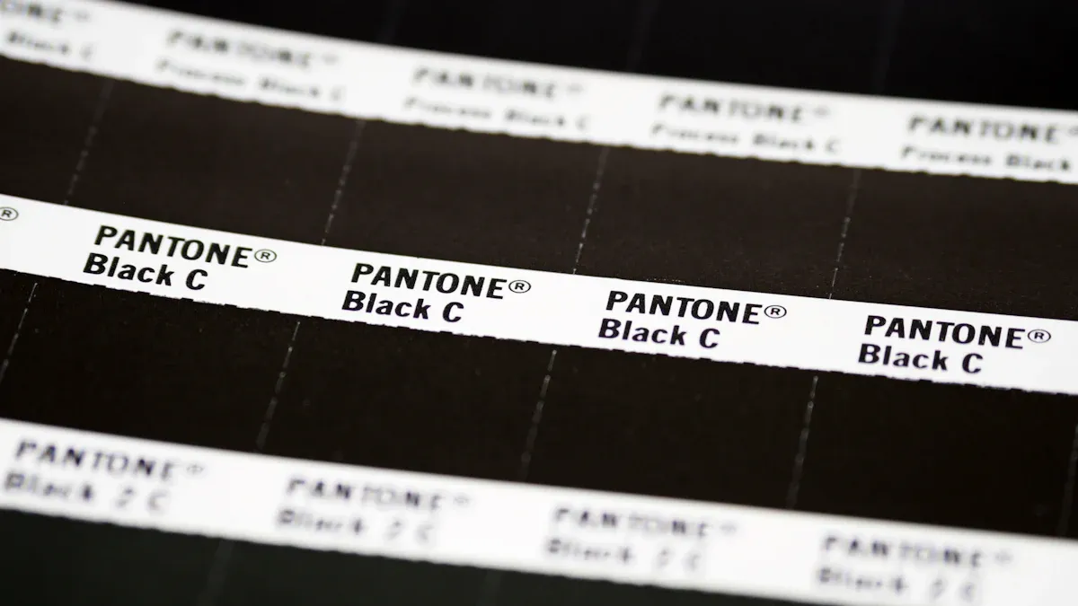
Verifying Output Using Spot Colors or Pantone Matching
Spot colors and Pantone matching help keep brand colors the same. These methods make sure prints look right on different materials and printers. Here’s how they help:
Mixing CMYK with Pantone colors makes brand colors more accurate.
Pantone colors give exact matches, improving print reliability.
Calibrating devices keeps color profiles steady for accurate results.
To check output, follow these steps:
Calibrate your printer for correct color printing.
Find CMYK values that match your Pantone colors.
Use the Pantone Matching System (PMS) guide to pick the closest CMYK match.
These steps let you create exact shades and match colors perfectly. Checking output with spot colors ensures professional prints and keeps your brand consistent.
Note: Always ask for a test print to check colors before big print jobs.
Making sure colors are accurate keeps your brand looking professional. Regularly checking and fixing colors gives bright, clear prints. This helps show your brand’s style and earns trust from customers. Using the right tools and steps can stop expensive errors. You’ll get great results every time. Take charge of your printing now to keep your brand strong. Use these tips to make sure your prints always look their best.
FAQ
How can I keep colors the same on different printers?
Use ICC profiles made for each printer, ink, and material. Regularly calibrate printers with tools like spectrophotometers. This helps keep colors consistent, even with different machines.
Tip: Print small samples first to check colors before big jobs.
How often should I adjust my printer for accurate colors?
Calibrate your printer every month or when colors seem off. Regular adjustments keep your printer working well and matching your brand’s colors.
Note: Changes in humidity or temperature can affect calibration. Adjust as needed.
Can I use one ICC profile for all my printing work?
No, you can’t. ICC profiles depend on the printer, ink, and material. Use specific profiles for each setup to get the best results.
Reminder: Update ICC profiles when you change inks or materials to avoid color problems.
Why do printed colors look different from screen colors?
Screens use RGB colors, but printers use CMYK. These systems show colors differently. Calibrate your monitor and use soft proofing with ICC profiles to see how prints will look.
Tip: Lower your screen’s brightness to better match printed colors.
What does RIP software do for color accuracy?
RIP software converts designs into printer-friendly formats and manages colors. It uses ICC profiles, adjusts special colors, and keeps prints consistent across devices.
Emoji Tip: 🖨️ Use RIP software to preview designs and fix mistakes early.