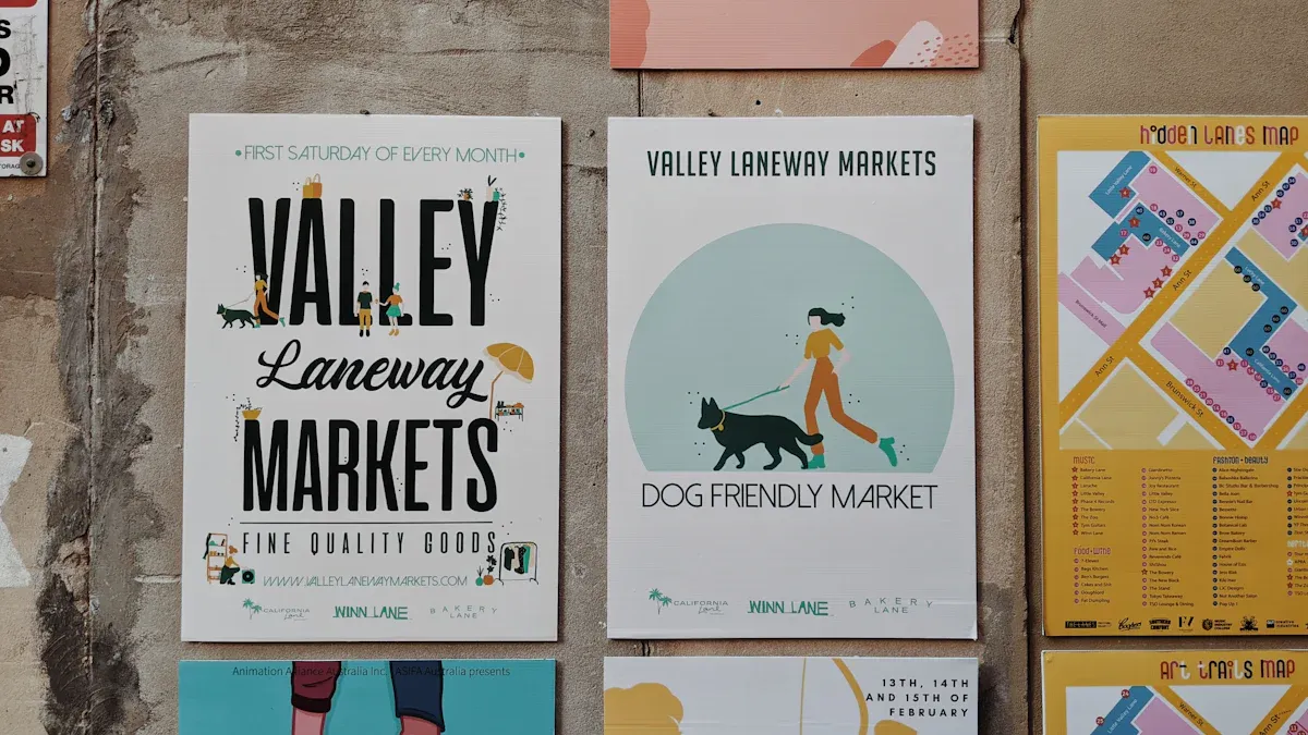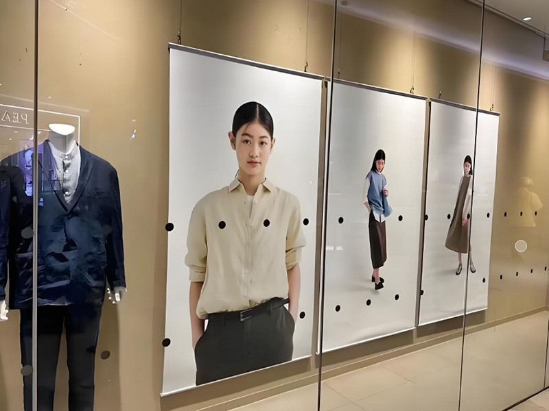
Have you ever entered an office and felt motivated right away? That’s the power of good posters! Choosing the Top Poster Sizes for office walls is crucial. Popular options like 18×24, 24×36, 36×48, and 48×72 not only enhance branding but also create more productive workspaces. A motivational quote near your desk or a big logo in the lobby can leave a lasting impression.
Key Takeaways
Picking the right poster size helps with branding and work focus.
Posters can make the office feel welcoming. Bright colors spark ideas, while soft colors help people relax.
Add fun features like QR codes to interest viewers and link them to websites.
Why Poster Size and Placement Matter in Office Spaces
The Psychology Behind Office Wall Graphics
Have you ever felt inspired in certain places? That’s not random. Colors and images around you can change your mood. They also affect how well you work. For example, a tech company, Innovatech, replaced boring gray walls with colorful designs. What happened? Employee focus and happiness went up by 25%. Another business used natural colors in meeting rooms. They saw a 20% rise in employee satisfaction.
Wall art isn’t just for looks. It makes spaces more exciting and uplifting. Bright colors can help you think creatively. Softer tones can make you feel calm. Picking the right poster size and design isn’t just decorating. It’s about making people feel good and work better.
Optimal Viewing Distance and Font Size: Evidence-Based Guidelines
Poster size isn’t only about covering a wall. It’s about making sure people can read it easily. A simple tip? For every inch of text height, people can read it from 10 feet away. So, if your poster has 2-inch letters, it’s clear from 20 feet.
Smaller posters, like 18×24, are great for desks or close spaces. Bigger ones, like 48×72, work well in lobbies or hallways. Always match the font size to where the poster will go.
Posters vs. Digital Screens: Sustainability and Attention Span
Screens may seem cool, but posters have their own benefits. Posters don’t need power, so they’re better for the environment. Plus, they don’t distract you with alerts or pop-ups. People focus on posters longer than screens.
Choosing posters saves energy and keeps things simple. Whether it’s an inspiring quote or a bold logo, posters grab attention without distractions.
Top Poster Sizes for Office Wall Applications
18×24 for Personal Workspaces and Small Rooms
Want to make your workspace feel more personal? The 18×24 poster size is a great pick. It’s small but still noticeable. Think about a calming picture or an inspiring quote above your desk. It’s not too big, so it won’t take over the space, but it will catch your eye and motivate you.
This size is perfect for tight spaces. You can hang it near your desk or place it on a shelf. It’s also useful in small meeting rooms to show team values or reminders. The 18×24 size keeps things neat and doesn’t make the room feel crowded.
24×36 for Meeting Rooms and Shared Collaboration Areas
The 24×36 poster size is both practical and easy to see. It’s big enough to stand out but not so large that it feels overwhelming. This makes it a good choice for meeting rooms or shared work areas. Use it to show team goals, project plans, or motivational messages that everyone can read.
Here’s how 24×36 posters are often used:
Resource Type | Quantity | Size |
|---|---|---|
Easels & Poster Boards | 24×36 |
You can place these posters on easels or boards, making them easy to move. This flexibility is great for brainstorming or team presentations. They’re also ideal for keeping teams focused with clear, visible goals.
36×48 and 48×72 for Hallways, Entrances, and Reception Areas
For hallways, entrances, or reception areas, you need something big and bold. That’s where 36×48 and 48×72 posters shine. These sizes are great for grabbing attention. Imagine your company’s logo or a powerful image of your mission displayed for everyone to see. It makes a strong first impression.
The 36×48 size fits medium walls, while 48×72 works best for large spaces. These posters make your office look professional and show off your brand. They’re also great for highlighting big achievements or upcoming events. With high-quality printing, these large posters can really stand out and impress visitors.
Strategic Poster Placement for Maximum Brand Visibility
Office Zones That Benefit from Poster Graphics
Where you put posters in your office matters a lot. Some spots work better for posters than others. Think about areas where people spend time or notice things first.
Reception Areas: This is the first place visitors see. A big poster with your company’s logo or mission can set the mood. It’s a great way to show off your brand and leave a strong impression.
Hallways: Hallways are busy places. Posters here can catch attention and share news about events or achievements. Use bright designs to make them pop.
Meeting Rooms: Posters in meeting rooms can spark ideas and teamwork. Show motivational quotes or team goals to keep everyone on track.
Personal Workspaces: Small posters fit well near desks. They add a personal touch, like a calming picture or helpful tip.
Break Rooms: Break rooms are great for fun or cheerful posters. They help employees relax and recharge during breaks.
Each area has its own vibe, so match your posters to the space.
Tip: Walk around your office and find spots that feel plain or dull. These are perfect places for posters.
Vertical vs. Horizontal Orientation Based on Wall Dimensions
Picking vertical or horizontal posters isn’t just about looks. It’s also about using wall space wisely.
Vertical Posters: These are best for narrow walls or tall spaces. They make the room feel higher and focus on growth or ambition. Use vertical posters for quotes or tall designs.
Horizontal Posters: These work well on wide walls or open areas. They feel bigger and can show wide images or detailed charts. Horizontal posters are great for hallways or behind reception desks.
Note: Measure your walls before choosing a poster shape. A good fit looks neat and professional.
Using both types of posters can make your office look more interesting. For example, try vertical posters near desks and horizontal ones in shared spaces. This creates a balanced and attractive design.
Design Tips to Amplify Impact with Branded Posters
Aligning Typography, Logo Placement & Brand Colors
Your poster should show your brand’s style and values. Start with your logo. Place it where people can see it easily. The top or center works well. It should stand out but not take over the design.
Colors are important for how people feel about your brand. Bright colors like red or orange show energy. Softer colors like gray or navy feel professional. Pick colors that match your brand and create the right mood. Fun fact: using the right colors can boost brand recognition by 80%. So, spend time choosing the best ones.
Fonts matter too. They should be simple to read and fit your brand’s vibe. Sans-serif fonts look modern, while serif fonts feel fancy. Use a grid to organize text and pictures. This helps people focus on the most important parts.
Tip: Leave some blank space in your design. It keeps things neat and makes key details stand out.
QR Codes, Campaign Hashtags & Interactive Add-Ons
Want your posters to be more fun? Add things like QR codes or hashtags. QR codes make posters interactive. People can scan them to visit your website, watch a video, or get a special deal.
Benefit | Description |
|---|---|
Better Engagement | QR codes let posters connect viewers to online content. |
Trackable Results | See how people interact to improve your marketing. |
Wider Audience | Link posters to websites to reach more people. |
Focused Marketing | Use QR codes to send specific groups to special offers. |
Hashtags are also helpful. They get people talking about your brand online. Add a call-to-action like “Use #OurBrandMission to share your ideas.” This gets people involved and spreads your message.
Pro Tip: Keep QR codes and hashtags simple. Complicated designs or long hashtags can confuse people.
Choosing the Right Finish: Matte, Glossy, or Laminated
The finish of your poster changes how it looks. Glossy finishes are shiny and make colors pop. They’re great for posters with lots of pictures. They also last longer and resist dirt, which is perfect for busy areas like hallways.
Matte finishes look smooth and professional. They don’t glare and work well for posters with lots of text or soft colors. Laminated finishes are super durable. They protect posters from damage and keep them looking new for years.
Tip: Match the finish to the poster’s purpose. Use glossy for bright designs, matte for calm ones, and laminated for long-lasting posters.
Case Study: How a B2B SaaS Company Used 24×36 Posters to Boost Internal Brand Culture

Project Overview: From Plain Walls to Brand Identity Highlights
Picture an office with dull, gray walls. That’s what employees at a B2B SaaS company faced daily. The leadership team saw this wasn’t helping morale or brand culture. They decided to use 24×36 posters to brighten the space and improve the vibe.
Their goal was clear: make boring walls into brand showcases. They created posters with their mission, values, and motivational quotes. Bold colors and simple fonts matched their brand style. Posters were placed in meeting rooms, hallways, and shared spaces for everyone to see.
Measurable Impact
The change worked wonders. Employees felt more connected to the company’s mission. A survey showed a 30% boost in satisfaction with the workspace. Team collaboration improved too, with 20% more employees saying meetings felt inspiring.
Visitors noticed the difference as well. Clients often said the posters made the office look professional and innovative. This small update had a big effect on both employee culture and client impressions.
Execution and Lessons Learned
The company kept things simple but effective. They used a local printer for high-quality posters and lightweight frames for easy setup. Posters were rotated every few months to keep designs fresh.
A key lesson? Involving employees in the design process mattered. Teams shared ideas for quotes and images, creating a sense of ownership. If you’re planning a similar project, include your team. It makes the effort more meaningful for everyone.
Tip: Start small. Even a few posters can make a big difference in your office.
Expert Commentary: What Environmental Designers Say About Workplace Posters
Interview Summary with Corporate Interior Architect
Ever think about how posters can change an office? Corporate interior architects say it’s all about telling a story. Posters shouldn’t just fill walls. They should share your brand’s values or goals. This makes boring spaces exciting and motivates employees while impressing visitors.
A study by Swenson and Siegel (2013) showed that interactive signs made people use stairs more. But Lewis and Eves (2012) found motivational posters alone didn’t work as well. Here’s a quick summary of findings:
Study Reference | Findings |
|---|---|
Swenson and Siegel, 2013 | Signs and artwork increased stair use. |
Lewis and Eves, 2012 | Prompts worked; motivational posters didn’t help much. |
Kwak et al., 2007 | Stair use rose with posters but dropped after removal. |
Åvitsland et al., 2017 | Nudging annoyed people, reducing stair use. |
Nocon et al., 2010 | Results were mixed or not significant. |
These studies show that poster design and placement are important. Architects suggest using posters as part of a bigger design plan. This helps create a workspace that feels inspiring and connected.
Supporting Research from Harvard Business Review and Gensler Workplace Surveys
Research proves posters can affect how people feel and work. Harvard Business Review says environmental graphics, like posters, improve employee engagement. Good visuals help workers feel closer to their company’s mission.
Gensler Workplace Surveys also show that well-designed offices, including posters, boost productivity. Employees in these spaces feel more focused and motivated.
Tip: Match posters to your company’s culture. Use quotes, brand values, and creative designs to make your office a better place to work.
By mixing expert advice and research, you can design a workspace that inspires and functions well.
Final Recommendations: Picking the Best Poster Size for Your Office
Easy Guide for B2B Clients
Choosing the right poster size for your office doesn’t have to be hard. Use this simple guide to match your posters to your office goals:
Know Your Goal
Decide what your posters should do. Are they for branding, improving focus, or sharing updates? Big posters like 48×72 are great for lobbies or hallways. Smaller ones, like 18×24, fit well near desks or in personal spaces.Check Your Wall Space
Measure your walls first. Wide walls need horizontal posters, while tall, narrow spaces work better with vertical ones. Medium sizes like 24×36 are perfect for shared areas because they’re easy to see but don’t take up too much room.Match Your Brand Look
Use your company’s colors, logo, and fonts to make posters feel connected to your brand. Bright colors can energize a room, while softer shades create a calm vibe.Make Posters Interactive
Add QR codes or hashtags to link posters to online campaigns. This makes them more fun and lets you track how people use them.
Pro Tip: Start small. Place one or two posters in key spots, like the reception area or meeting rooms. Add more later based on feedback.
By using this guide, you’ll pick the best poster sizes for your office. Whether you want motivational posters for desks or big prints for branding, the right size can make your office more inspiring.
Choosing the right poster size can transform your office. It boosts branding, inspires employees, and creates a professional vibe. Take a moment to assess your office layout and think about your goals.
Tip: Work with professional designers or printers. They’ll help you create posters that fit your space and reflect your brand perfectly.
FAQ
What’s the best poster size for a small office?
The 18×24 size is great for small offices. It’s small enough to fit but still stands out. Use it in personal workspaces or tiny meeting rooms without making the area feel crowded.
Can I mix vertical and horizontal posters in one office?
Yes, you can! Mixing both styles makes walls look more interesting. Vertical posters are good for tall, narrow spaces. Horizontal ones work well on wide walls. This helps you use your wall space better.
How do I make posters last longer in high-traffic areas?
Pick laminated finishes. They stop damage and keep posters looking new. Laminated posters stay bright and strong, even in busy spots like hallways or lobbies.
Tip: Wipe laminated posters gently with a soft cloth to keep them clean.


